
Order Tracking Experience Improvement
A holistic redesign project to improve visibility of order status and streamlining fulfilment service for the customers
Project type: UX/UI design
Period: Over the course of 4 month commencing in June, 2023
My Role and Team: UX/UI Designer
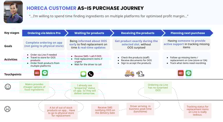
1.The project background
The business unit of Makro PRO, including the customer service team, identified that the top customer complaint was related to the order tracking experience. Customers frequently called to inquire about the status of their orders, complain about delays, or surprised missing item at delivery.
The key problem was around the delayed order, which accounted to 49% of the total queries.
Using findings from the diary study and analysing the customer journey, I discovered relevant qualitative data indicating order details do not provide adequate and real-time information about the order status, which related to the "lack of information on when the driver will arrive" leading to frustration and a sense of helplessness as customers felt "there was nothing I can do but wait for the driver to call".
2. The Problem Statement
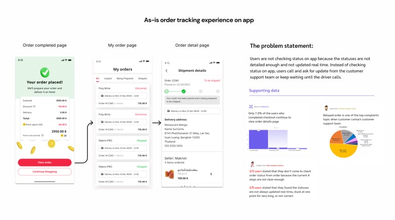
We have identified the problem statement concerning the inadequate and non-real-time information on the order detail page, which is corroborated by the drop-off rate observed on MixPanel. It is clear that users often do not visit the order detail page immediately after placing an order.
In our initiative to enhance UX/UI, the problem statement focuses on:
"How might we establish trust among users in our order status updates, encourage them to utilise the self-tracking service on the app, and rely on the provided information to prepare for receiving items and making payments upon arrival?"
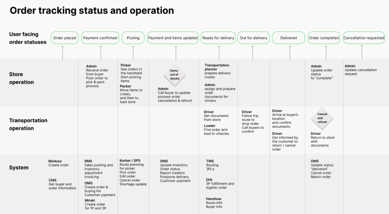
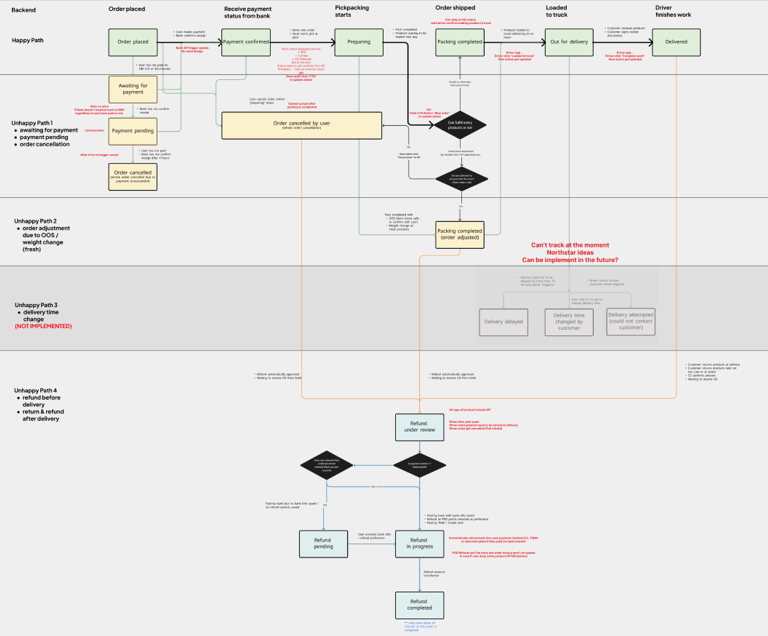
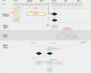
Understanding the as-is fulfilment operational process
I arranged a workshop with the developers and operation excellence team, to map out a service blueprint of what happens backstage that could further use to reflect back as order statuses. We found that even though we have different trigger points that potentially can breakdown more steps, these are mostly inactive on the system.
It was spot from the workshop that what happens when there are out-of-stock items in an order has not been streamlined. While some store will call and confirm with customers, some stores will send out the product with a delivery note. However this information will not appear on the app.
3. The design process
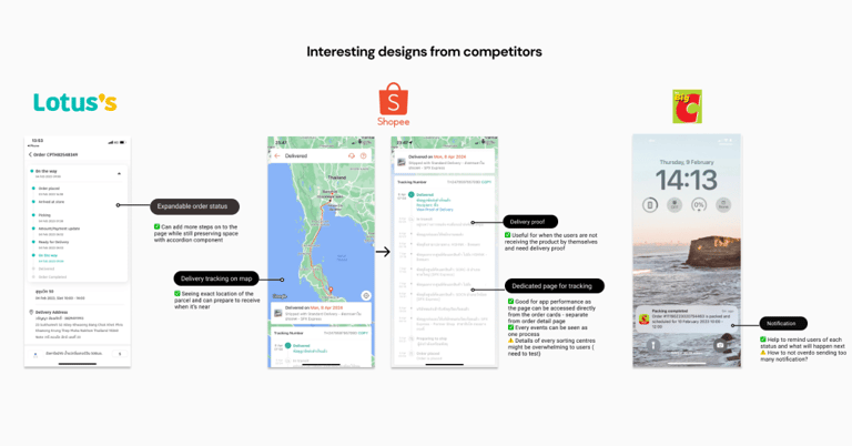
More discovery with competitive analysis
To gain a better understanding of market standards and customer expectations, I began examining competitor designs that encompass their order tracking journeys. It became apparent that they not only feature more detailed events in their tracking experiences but also optimise app performance by distinguishing between order status and delivery status, complete with real-time notifications.
These findings have prompted several questions for our developer team. For instance, do we have additional data events that can be displayed as status updates? What are the root causes of our performance issues, and would separating pages help alleviate them? Lastly, what obstacles currently prevent us from sending real-time notifications to users?
A new proposal of user journey and service design
After a few workshop sessions with the developers and operation excellence team, we have identified events that are feasible to add as new status steps, making order tracking more in-details and more real-time.
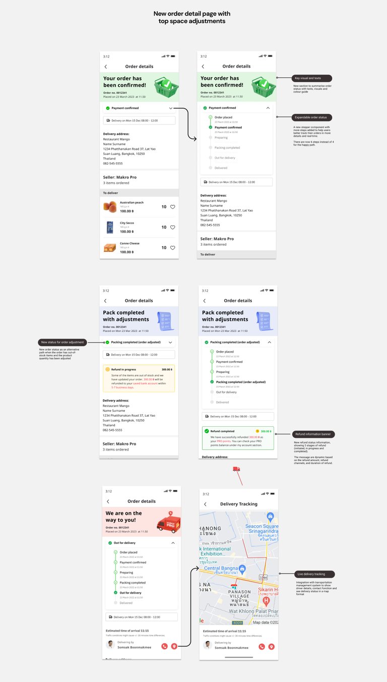
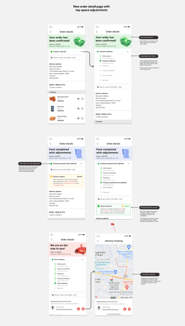
To help solve surprised missing items issue from out-of-stock situation, I proposed to add “Packing completed (order adjusted)” with notification message to help remind the users that they will not get all the products delivered.
4. The outcome
Improved order tracking experience
The redesign of the order tracking experience adopted a user-centred approach, focusing on addressing the most common pain points faced by customers. Key improvements included:
Real-time status updates with clear, colour-coded progress indicators to provide instant clarity.
Dynamic delivery ETAs that reflected delays or changes, keeping customers informed at every step.
Detailed order breakdowns and actionable next steps, such as rescheduling deliveries or directly contacting support.
Mobile-first design enhancements, ensuring seamless usability across all devices.
Increased capacity of customer support team
Post-launch analytics revealed a significant decrease in customer queries, especially for questions like “Where is my order?” and “When will it arrive?”. The enhanced experience not only improved customer satisfaction but also reduced the workload on support teams, enabling them to focus on resolving more complex issues.
Strengthened fulfilment teams
This project was fostering collaboration across previously siloed fulfilment teams. By bringing these teams together for the first time, we were able to align on shared challenges, streamline data flows, and uncover deeper insights into process inefficiencies. This collaboration not only supported the redesign but also strengthened interdepartmental communication and problem-solving.
5. My personal takeaways
1) The power of simplification
Simplifying intricate details into user-friendly formats, such as visual progress indicators, proved that presenting information intuitively builds confidence, reduces customer queries, and strengthens trust in the brand.
2) Iterative design yields tangible results
Through ongoing collaboration with stakeholders, we implemented small, iterative changes based on user feedback. These adjustments, such as refining status updates and delivery timelines, showcased how starting small and refining incrementally can lead to significant outcomes, including a measurable reduction in customer support enquiries.
3) Collaboration unveils opportunities for improvement
Working closely with cross-functional teams—including engineering for real-time data integration and customer support for insights into recurring queries—was instrumental in uncovering hidden inefficiencies. This collaborative approach allowed us to identify and address critical pain points, resulting in a seamless and user-focused solution.
4) The ripple effect of enhanced user experience
Improving a single touchpoint—like the order tracking page—had far-reaching benefits. It not only reduced operational costs by decreasing support workload but also elevated customer satisfaction, retention rates, and overall brand loyalty. This highlighted how thoughtful design changes can deliver both immediate and long-term value.
Anya Hemtanon
Crafting user experiences with a lean approach
anyahem.info
© 2024. All rights reserved.