Optimising app homepage content
An unmoderated usability test to evaluate usability between versions of content optimisation design
Project type: Usability test (unmoderated)
Period: 1 week project conducted in January, 2023
My Role and Team: A pair work between myself (UX Researcher) and a Product Designer
1.The project background
Makro PRO app was a preferred order channel compared to the web version for Makro e-commerce for shop owners and food retailers. However, there had been feedbacks from customer interviews about functionality, performance, and the look and feel of the app, especially on its homepage.
The design team wanted to iteratively improve homepage design to optimise usability and value for the users. I paired work with a designer in exploring new design possibilities, and came up with some adjustments on the new iteration.
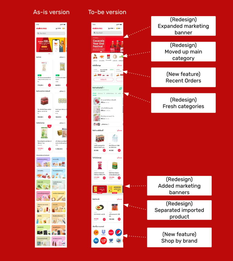
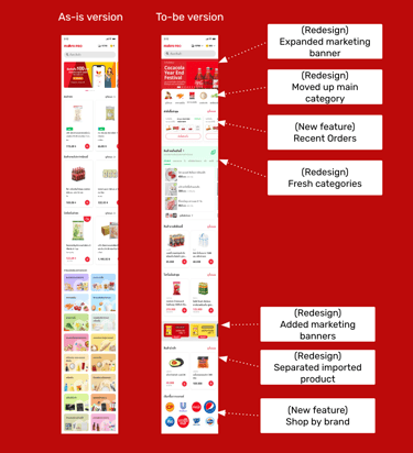
The new adjustments included a redesign of the top section, new feature introduction, as well as enhancement on the UI look and feel of the homepage overall. As a result, we had a prototype to be use for a design usability testing.
2. The methodology
The QUESTIONS & METRICS
The main research questions & metrics for the testing cover:
1) Is the new section "recent order" accessible and usable? (time on task & completion rate)
2) Is the redesigned section "fresh category" accessible and usable? (time on task & completion rate)
3) Is the overall to-be design more usable and desirable? (overall design satisfaction)
4) What is the most valuable as in "useful" content section on the homepage? (ranking of "most valuable content)
5) What are some improvement opportunities for future homepage design? (qualitative feedback)
The WHO and the PLATFORM
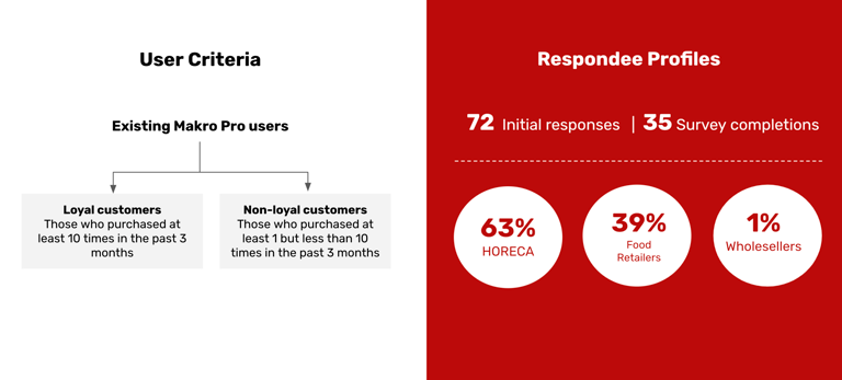
As comparing the as-is version with to-be can cause familiarity bias among the current app users. Together with the designer and a data analyst, we segment our participant profile into 2 groups; loyal and non-loyal customers.
To reduce the bias caused by order of the tasks, the participants were separated into 2 cohorts where 50% of them will see the as-is version first, and another 50% will see the to-be version first.
The HOW
In the test, participants were tasked to complete homepage exploration, use new "recent order" section, and access "fresh categories" section. This was followed by section value sorting and follow up questions.
We opted for an unmoderated concept test using Maze as the tool come with the benefit of unmoderated testing functionality and participant video recording upon consent. With the help from our customer support team, SMS with a link to participate were sent to potential participant groups by 2 separate chunks of a total 1,000 customers.

3. Data collection and analysis
Challenge in low-response rate
From the SMS sent out, we found a low response rate which led to a new SMS message review and increased participant incentive. For the second round of survey link sent out to 1,000 customers, we received total of 72 responses with 35 survey including task completion.
Heat map analysis to assess usability
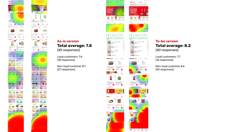
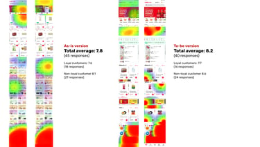
Utilising Maze heat map data, we could see the patterns of how the participants explore the homepage, the sections they were interested in, as well as the time take to complete a certain tasks.
4. The findings and outcome
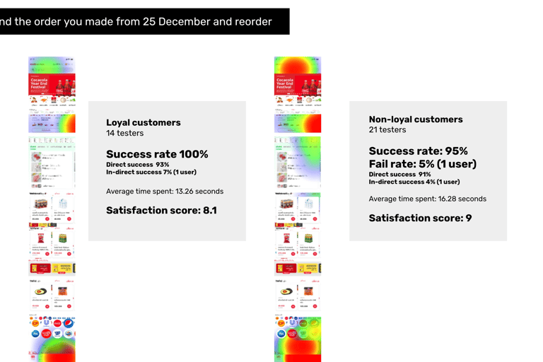
The recent order and fresh categories sections were both proved accessible and usable.
The recent order and new categories sections were found to be accessible and easy to use. However, task completion took slightly longer, likely because users tended to rely on the “search bar” when seeking specific products on the homepage.
To-be versions being engaging more than the as-is
In comparison to the current version, the updated design showed increased user engagement. Users interacted more frequently with the recent orders section and advertising banner. Qualitative feedback revealed that users appreciated the visibility of different products on the homepage, though some expressed minor concerns about potential system performance issues due to increased product detail
Design adoption from the test result
The product team decided to adopt the new version of the homepage, with two important considerations:
1. Mental Models Shape Interaction Patterns
Users tend to default to familiar features like the search bar for product discovery, especially on the homepage. This suggests that even when new, useful sections are added, users may overlook them if they don't align with their ingrained habits. This highlights the importance of gradually introducing new features and reinforcing their value over time to help shift these mental models.
2. Balancing Usability with Performance Considerations
While added product details on the homepage enhance visibility and engagement, there’s a trade-off with performance that users noticed. This speaks to a broader challenge of delivering detailed, visually engaging experiences without compromising speed or efficiency, especially in mobile applications. Finding this balance will be crucial in future iterations to ensure both engagement and satisfaction remain high.
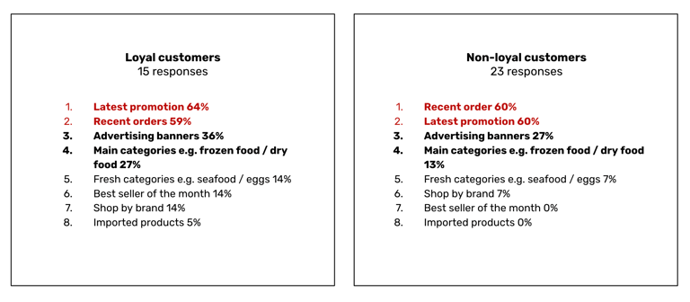
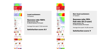
Latest Promotion and Recent Order are viewed as valuable by both group of customers.
Both loyal and non-loyal customer groups found the Latest Promotion and Recent Order sections valuable. Loyal customers, in particular, focused on promotions, ad banners, and monthly best-sellers. Non-loyal customers showed a preference for the recent orders section, likely as it streamlined their purchasing process. This aligns with insights from other user interviews, where Makro PRO was compared to competitor apps like Shopee and Lazada that offer quick purchase shortcuts.
5. My personal takeaways
1) Challenges of introducing new testing methods to low-tech users
Although using unmoderated testing with heat map analysis proved to be a powerful way to gather insights, introducing the method to users who were less familiar with digital tools posed some challenges, as low-tech users often needed more guidance to understand how to interact with the test setup. This led to less accurate results or inconsistencies in the data collected.
2) Low response rate challenges with SMS recruitment
Recruiting participants via SMS resulted in a lower-than-expected response rate, likely due to SMS being perceived as less engaging or more easily overlooked than other communication channels. This experience highlighted the importance of carefully considering recruitment methods and testing alternative channels for participant engagement. In future projects, it would be beneficial to explore a combination of email, in-app prompts, or social media to improve response rates and reach a broader audience.
Anya Hemtanon
Crafting user experiences with a lean approach
anyahem.info
© 2024. All rights reserved.
